Whether you’re monitoring ER visit trends, watching course registration drop-offs, or tracking onboarding progress, keeping an eye on your most important metrics across your workflows shouldn't be complicated - or manual.
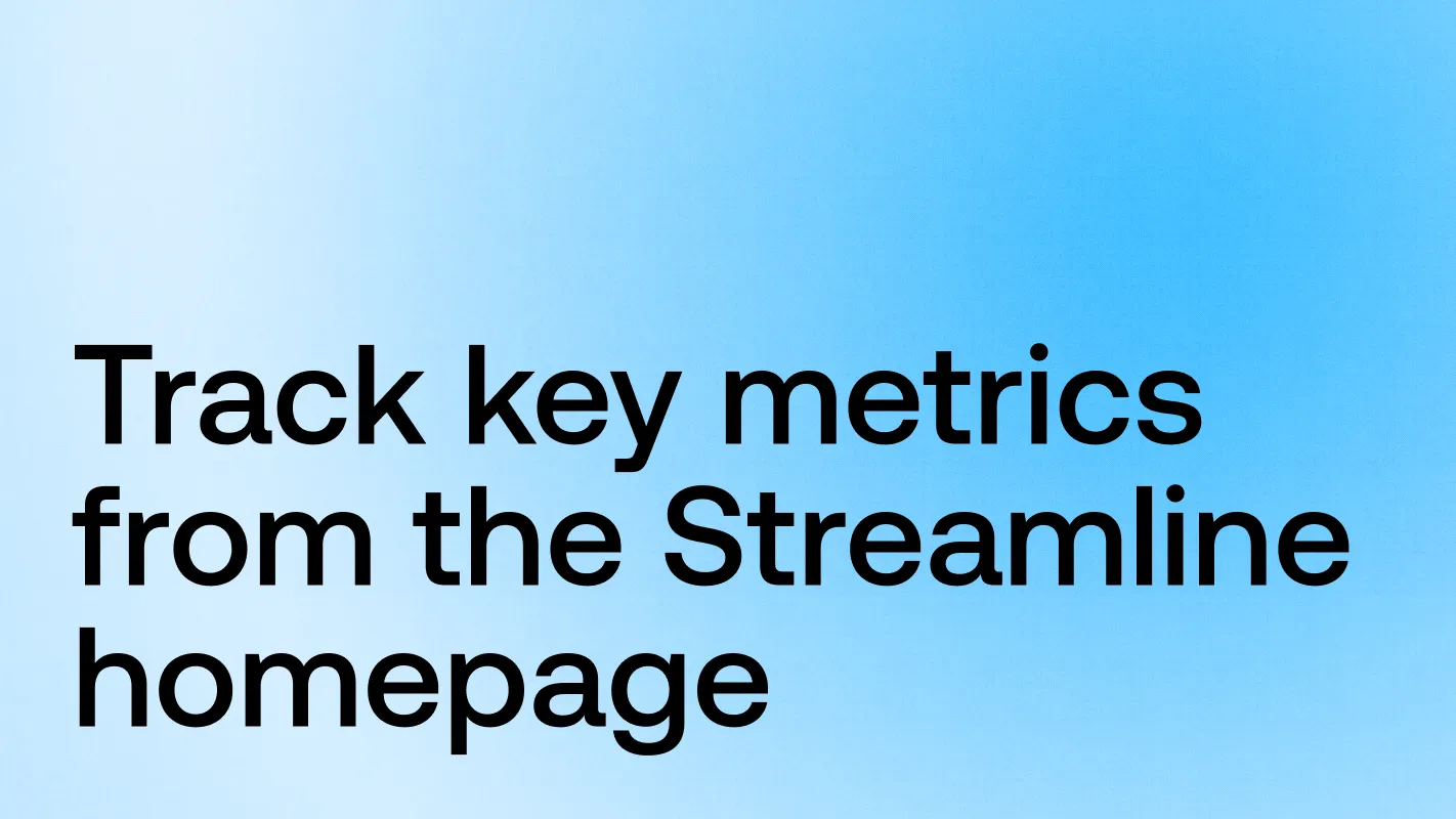
That’s why we’re introducing Charts in Intellistack Streamline.
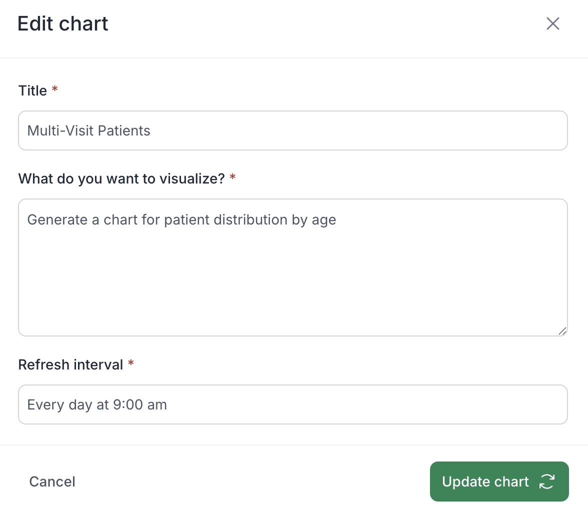
Charts let you generate personalized, AI-powered visuals - directly from your homepage - and revisit them anytime. No SQL, no dashboards, no repeated setup. Just the insights you care about, right where you need it in your Streamline account.
How it works
From your Streamline homepage, simply enter a natural language prompt describing the chart you want. For example:
“Show weekly referral volume for the past 6 months”
“Display ER admissions by shift this week”
“Trend of course dropouts by department”
Streamline will generate a chart using your prompt and display it instantly on your homepage.
If the chart doesn’t look quite right, you can refine your prompt and try again until it does. And if you’ve already fine-tuned a prompt using Omni (our built-in AI agent), you can paste it into the homepage to generate your chart there.
Each chart updates automatically on the schedule you define - daily, weekly, or even more frequently. You can also refresh a chart manually at any time. All charts are private and personalized, so what you see is uniquely yours.
Why it matters
Charts are a fast, flexible way to stay on top of trends across your workflows that matter to you - without having to rebuild reports or rely on pre-built dashboards.
By giving you direct access to visual insights from your homepage, Charts help:
Reduce dependence on static reports or data team requests
Keep teams aligned with always-fresh data
Make your Streamline experience even more action-oriented
Think of it as your personal command center for insights.
Built for real-world use cases
Here’s how teams are already using Charts across different industries:
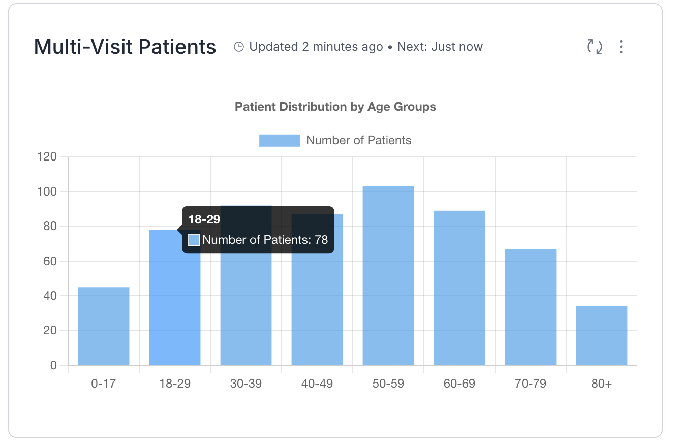
Healthcare: Supervisors monitor patient volume by shift to adjust staffing in real time.
Higher Ed: Registrars track course drop-offs to flag advising needs.